Style & Context
Influences
Lo-fi aesthetics, glitch art, candid portraiture, DIY zine culture
Location
It reflects the digital "neighborhoods" where artists like BROCKHAMPTON connected, far from traditional industry strongholds.
Visual Language
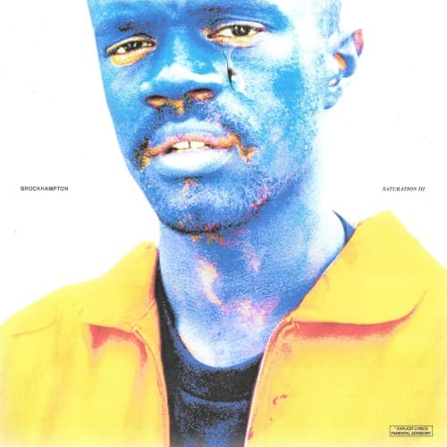
This manipulated photographic style captures the raw, unfiltered essence of BROCKHAMPTON's collective, embracing imperfections as part of its aesthetic.
Symbols
Blue Skin
The unnatural blue skin suggests a profound emotional state, perhaps sadness, alienation, or an altered perception of self in the digital age.
Single Tear
A lone tear rolling down his cheek conveys authentic vulnerability and emotional exhaustion amidst the collective's relentless output.
Yellow Jacket
The bright yellow jacket provides a stark contrast to the blue skin, potentially symbolizing a fragile sense of hope or identity.
Where Sound Meets Image
The cover's emotional intensity directly mirrors the album's exploration of angst, identity, and internal struggles within the collective. Songs like "BLEACH" and "ZIPPER" carry a similar blend of raw emotional outpouring and energetic, sometimes abrasive, production, reflecting the visual's jarring contrast. The highly saturated, somewhat distorted image perfectly encapsulates the "saturation" theme of the trilogy, symbolizing an overwhelming flood of feelings and experiences. It's a visual manifestation of their unfiltered, often chaotic, lyrical narratives.
This cover reinforced BROCKHAMPTON's unique visual brand, solidifying their reputation for bold, unconventional imagery within hip-hop. Its blend of emotional rawness and digital manipulation helped set a standard for independent artists pushing aesthetic boundaries beyond mainstream polish. It influenced a wave of artists to embrace lo-fi, deeply personal cover art that felt more authentic to their internet-native origins.