Style & Context
Influences
Minimalist art, contemporary sculpture, conceptual design
Location
It speaks to the psychological landscape of an artist grappling with identity beyond any specific block or locale.
Visual Language
The aesthetic marries polished digital rendering with the raw simplicity of a hand-drawn element, creating a compelling visual tension.
Symbols
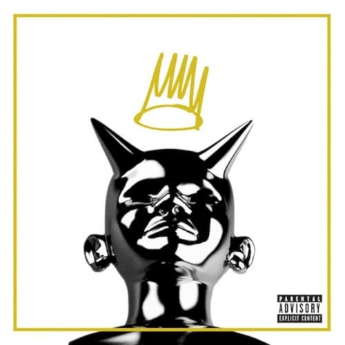
Chrome Head with Horns
This figure embodies the internal battle against temptation and the allure of hedonism often prevalent in the music industry.
Hand-Drawn Crown
The sketch-like crown represents the burden of rap royalty, suggesting a desired kingship is incomplete or troubled.
White Background
The expansive white space signifies a sterile or pure environment, making the sinful figure stand out more dramatically.
Where Sound Meets Image
The visual directly reflects the album's core themes of morality, temptation, and the pursuit of greatness while acknowledging human imperfection. Tracks like 'Villuminati' delve into the dark side of fame and spiritual conflict, while 'Runaway' further explores the struggle with personal demons. The dichotomy of the crown and horns precisely illustrates Cole's self-awareness of being a 'born sinner' yet striving for higher ground, a narrative woven throughout the album's thoughtful lyricism and soulful production.
This cover's striking simplicity and profound symbolism have made it a memorable piece in hip-hop visual history. It solidified J. Cole's brand as an artist unafraid to explore personal vulnerabilities, inspiring a more conceptual approach to album art within conscious rap. Its stark imagery continues to resonate, proving that less can indeed be more when conveying complex narratives.