Style & Context
Influences
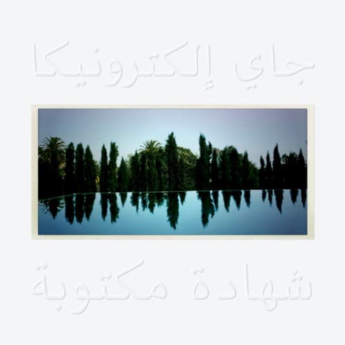
Islamic art traditions, minimalist design, Sufism aesthetics, Rothko color fields
Location
While Jay Electronica emerged from New Orleans, this cover transcends regional identity to claim space for Islamic spirituality in hip-hop aesthetics.
Visual Language
The stark simplicity rejects hip-hop's maximalist visual trends, choosing restraint that echoes Jay's sparse, intentional approach to releasing music.
Symbols
Arabic calligraphy
The script translates to the album title, asserting Islamic identity in a genre rarely centered on Muslim faith.
Perfect water reflection
The mirrored trees symbolize the balance between material world and spiritual reflection Jay seeks throughout the album.
Cypress trees
These trees appear in Islamic art as symbols of eternity, connecting to Jay's themes of timelessness and faith.
Where Sound Meets Image
The reflective water mirrors the album's structure—Jay Electronica's verses bounce off Jay-Z's, creating dialogue between student and mentor, seeker and veteran. The natural setting connects to the album's samples of sermons and spiritual teachings, grounding abstract metaphysics in earthly beauty. The Arabic script reinforces tracks referencing Nation of Islam teachings and Islamic philosophy, while the tranquil landscape contradicts the urgency in Jay's delivery, creating productive tension. The emptiness of the scene—no people, no urban markers—matches Jay's reclusive mystique and the album's focus on internal spiritual work over external flash.
This cover helped normalize Arabic script and Islamic visual language in mainstream hip-hop packaging, opening doors for other Muslim artists to center their faith visually. The minimalist approach influenced subsequent album artwork that favored contemplative aesthetics over maximalist design. By avoiding the typical trappings of hip-hop cover art—no artist photo, no bold graphics—Jay Electronica created a template for artists prioritizing substance over spectacle, proving debut albums don't need aggressive marketing visuals to make statements.