Style & Context
Influences
Crime scene photography, photojournalism, street photography, evidence documentation
Location
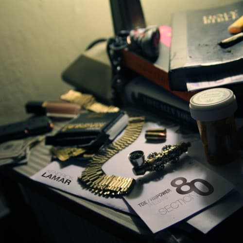
This tabletop snapshot could exist in any Compton living room, capturing the normalized coexistence of weapons and weed in neighborhoods shaped by the crack epidemic's aftermath.
Visual Language
The slightly blurred background and sharp foreground create a voyeuristic quality, as if we're examining personal belongings left on a table after someone stepped away.
Symbols
Ammunition rounds
The golden bullets scattered across the frame represent the constant presence of violence in the Reagan-era generation Kendrick chronicles throughout the album.
Rolling papers and blunt
These items signal the self-medication and escape mechanisms Section.80 babies used to cope with inherited trauma and systemic neglect.
Coffee cup
The everyday beverage container grounds the image in mundane reality, suggesting these dangerous items exist alongside normal life in the community.
Where Sound Meets Image
The scattered, unfocused arrangement mirrors the album's exploration of fragmented identities and competing influences pulling at young Black lives in Compton. Just as the songs jump between different characters and perspectives — ADHD-afflicted youth, Keisha's Song's tragic narrative, the prescription drug themes in Prescription/Oxymoron — the cover presents multiple elements without forcing them into neat composition. The presence of both destructive items and ordinary objects reflects Section.80's central tension: how do you build a meaningful life when survival tools and self-destruction sit side by side on the same table?
This cover established Kendrick's visual identity as an artist who prioritizes substance over spectacle, influencing how independent hip-hop projects could present themselves without major label budgets. The raw photography approach became a template for authenticity in the streaming era, proving that powerful album art doesn't require elaborate photoshoots or graphic design teams. Compared to good kid, m.A.A.d city's Polaroid or DAMN.'s bold typography, Section.80's cover remains the most unadorned, setting a baseline of documentary honesty that Kendrick's later visual choices would build upon or intentionally contrast against.