Style & Context
Influences
Renaissance memento mori paintings, gothic horror imagery, classic hip-hop portraiture
Location
Coming from Queensbridge, the largest public housing development in North America, Nas spoke from the birthplace of conscious East Coast lyricism.
Visual Language
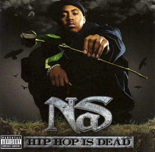
The low-angle hero shot elevates Nas to prophetic status while the composited environmental elements create an otherworldly graveyard scene.
Symbols
Single black rose
The black rose traditionally symbolizes death and farewell, here representing hip-hop's creative spirit suffocated by commercialism.
Circling crows
These carrion birds wait to pick clean hip-hop's corpse, signifying vultures exploiting the culture for profit without respect.
Barren ground
The dead grass beneath Nas represents the creative wasteland he perceived in mainstream rap's ringtone era dominance.
Where Sound Meets Image
The funeral imagery directly supports the album's central argument across tracks like the title cut and 'Who Killed It?' where Nas indicts commercialization, corporate exploitation, and artistic compromise. The rose he offers represents the respectful goodbye to hip-hop's golden age values—the boom-bap production and socially conscious lyricism that defined his own Illmatic era. The darkness enveloping the image mirrors the album's somber, stripped-down production that rejected the shiny, synthesized sounds dominating 2006 radio.
The cover became rap's most controversial visual statement of the 2000s, crystallizing debates about artistic integrity versus commercial success that still resonate. Its gothic aesthetic influenced later rap album art exploring mortality and legacy themes, while the stark typography treatment of the logo became widely imitated. The image remains shorthand for the generational divide between boom-bap traditionalists and newer regional sounds.