Style & Context
Influences
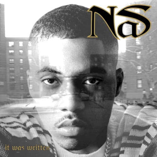
Documentary photography, classic album covers, noir aesthetic
Location
Queensbridge is an indelible force, shaping the artist's narrative and worldview, more than just a backdrop.
Visual Language
The classic black and white photography seamlessly fuses Nas's portrait with the urban landscape through double exposure.
Symbols
Double Exposure
This visually represents Nas as a product of his environment, showing the streets etched into his very being.
Queensbridge Projects
The visible apartment buildings symbolize the foundational struggles and collective experiences shaping Nas's identity.
Nas's Direct Gaze
His intense, direct gaze conveys unwavering truth, challenging the listener to confront the realities he presents.
Where Sound Meets Image
The cover directly mirrors the album's themes of self-reflection, street wisdom, and the internal battles of a young man shaped by his environment. Tracks like "The Message" and "Street Dreams" find their visual counterpart in Nas's transparent portrayal, showing how his experiences are intrinsically tied to the asphalt and brick of Queensbridge. The slightly darker, more contemplative feel of the cover perfectly aligns with the album's shift towards more mature, often cinematic narratives, moving beyond the raw youthful energy of his debut. This visual metaphor of the streets embedded within him truly captures the essence of "It Was Written."
The cover's innovative double exposure technique became a frequently referenced visual motif in hip-hop, especially for artists aiming to depict deep connections to their origins. It solidified a powerful aesthetic for conveying internal struggle alongside external environment, influencing subsequent album art that sought similar depth. Its stark simplicity and profound meaning continue to make it a memorable piece in hip-hop's visual history.