Style & Context
Influences
Andy Warhol screen prints, Bauhaus minimalism, New Wave album aesthetics
Location
Golf Wang's Ladera Heights aesthetic meets Odd Future's art-school outsider mentality, now matured into high-concept experimentation.
Visual Language
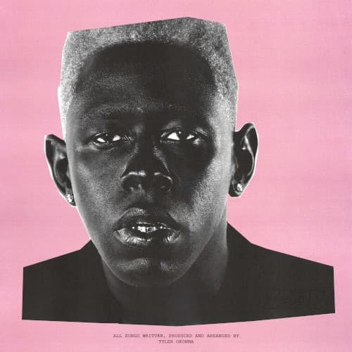
The flattened tones and stark composition borrow from 1980s art-pop visual language that matches IGOR's synth-heavy production.
Symbols
Bleached flat-top haircut
The severe geometric cut represents Tyler shedding his previous personas for something architecturally precise and controlled.
Direct frontal gaze
The unflinching eye contact demands listeners confront the album's emotional rawness without the comfort of ironic distance.
Pink background void
The empty space strips away context and ego, leaving only the vulnerability Tyler explores throughout IGOR's narrative.
Where Sound Meets Image
The severe simplicity mirrors IGOR's narrative focus — one toxic relationship examined from every painful angle. Just as the album strips away traditional rap structures for synth-driven mood pieces, the cover removes all context and decoration. The pink's artificial sweetness matches how Tyler coats heartbreak in sugary production. That direct stare reflects lyrics where he stops hiding behind characters and confronts obsession head-on.
This cover helped normalize genre-fluid presentation in hip-hop visual identity. The minimalism influenced a wave of alternative rap artists choosing stark portraiture over flashy graphics. It proved a hip-hop album could look like a Helmut Lang campaign and still connect. The design's confidence set a template for how artists could signal sonic experimentation through pure visual restraint.