Style & Context
Influences
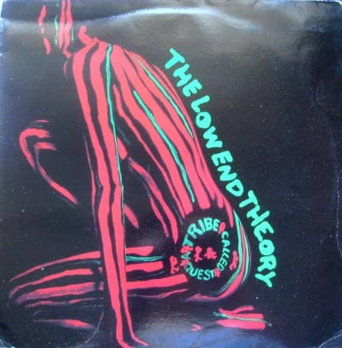
African art, abstract graphic design, early hip-hop aesthetics
Location
It reflects the vibrant intellectual and artistic energy emanating from New York City's progressive communities.
Visual Language
The stylized illustration blends abstract forms with bold graphic elements, creating a distinctive visual identity.
Symbols
Striped Figure
This stylized form represents the raw, fundamental elements of jazz and hip-hop culture.
Red & Green Stripes
These vibrant lines evoke Pan-African colors, signaling deep cultural pride and identity.
Crouching Pose
The figure's introspective stance suggests a deep dive into the album's foundational 'low end' frequencies.
Where Sound Meets Image
The stark, abstract figure directly mirrors the album's stripped-down, jazz-infused boom-bap sound, focusing on the essential elements of rhythm and flow. Just as the figure is composed of fundamental lines, the music breaks down jazz samples to their core, creating something new and profound. Tracks like "Jazz (We've Got)" and "Excursions" champion the art form's roots, while the collective energy of the group, a central theme, is subtly implied by the figure's almost communal, ancestral presence. The overall mood of the cover—mysterious yet inviting—prepares listeners for an album that is both deeply complex and effortlessly cool.
This cover remains a touchstone for minimalist design in hip-hop, proving that powerful imagery doesn't require overt messaging. It influenced a generation of artists to explore abstraction and cultural symbolism in their visual branding. The distinct color palette and graphic style became synonymous with a specific, intelligent strain of hip-hop, shaping how albums could visually represent sonic innovation.