Style & Context
Influences
Diego Rivera murals, German Expressionism, political poster art
Location
The cover reflects independent New York's intellectual approach to hip-hop commentary on American work culture.
Visual Language
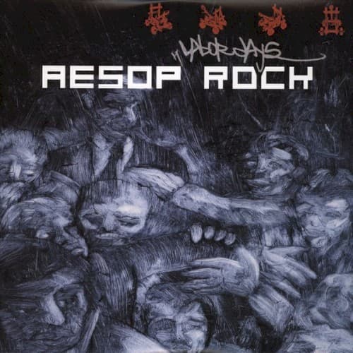
The sketchy charcoal rendering creates texture that feels physically exhausting, mimicking the grit of manual labor itself.
Symbols
Intertwined bodies
The figures merge into an indistinguishable mass, representing workers losing identity to the machine of capitalism.
Red Chinese characters
The characters translate to elements of labor philosophy, grounding abstract struggle in concrete cultural tradition.
Stark white typeface
The clinical sans-serif font evokes factory signage and the cold efficiency of industrial systems.
Where Sound Meets Image
The densely packed bodies mirror Aesop Rock's famously complex lyricism, where words layer over each other like laborers in a crowded factory. Tracks like 'Daylight' and 'No Regrets' examine quiet desperation and the search for meaning in repetitive existence, themes this cover telegraphs before a single beat drops. The absence of individual faces parallels Aesop's abstract wordplay, which obscures straightforward narrative in favor of impressionistic truth about survival under capitalism.
This cover established a visual language for intellectually ambitious hip-hop that rejected both street-realism photography and graphic excess. Its fine-art approach influenced subsequent indie rap aesthetics, proving album art could function as political commentary rather than artist branding. The design remains a reference point for underground releases addressing class consciousness and economic critique.