Style & Context
Influences
Street photography, album covers from EPMD, Das EFX, Gang Starr
Location
Brooklyn's Bucktown section birthed this aesthetic, where basement studios and street corners served as both recording booth and promotional platform.
Visual Language
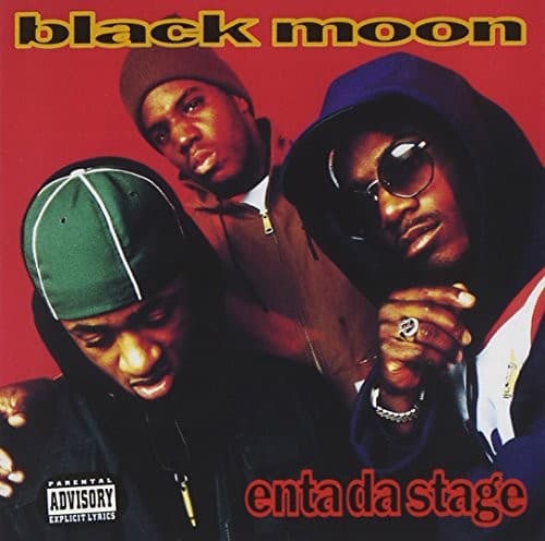
The unflinching direct flash creates harsh shadows that emphasize the rawness Boot Camp Clik championed in their sound.
Symbols
Three-man formation
The tight clustering represents crew unity, the strength-in-numbers mentality that defined Brooklyn's Boot Camp Clik era.
Direct camera stare
Each MC locks eyes with the viewer, issuing a challenge that mirrors the album's confrontational lyrical stance.
Parental Advisory sticker
The explicit content warning became a badge of honor for hardcore acts, signaling uncompromised artistic vision.
Where Sound Meets Image
The claustrophobic framing mirrors Evil Dee's dense, sample-heavy production, where layers of sound create an enclosed sonic space. The aggressive posturing visually translates Buckshot's battle-ready lyrics and the crew's confrontational approach to rhyming. The red background pulses with the same intensity as the album's hard-hitting drums, while the direct stares echo how tracks like 'Who Got Da Props?' directly challenge listeners and competitors alike.
This cover established the visual template for Boot Camp Clik's entire roster, prioritizing crew presence over individual celebrity. The raw aesthetic influenced countless independent hip-hop releases throughout the mid-90s, proving that street credibility could be communicated through unflinching directness rather than stylized imagery. Its rejection of commercial polish helped define what underground hip-hop looked like when major labels weren't involved.