Style & Context
Influences
Concert posters, vintage blacklight art, Grateful Dead aesthetics, vaporwave, Travis Scott's Rodeo
Location
The cosmic setting transcends specific Chicago blocks while the DIY aesthetic reflects Chatham's independent spirit.
Visual Language
The style merges hip-hop portraiture with jam band visual culture, bridging seemingly opposite musical worlds.
Symbols
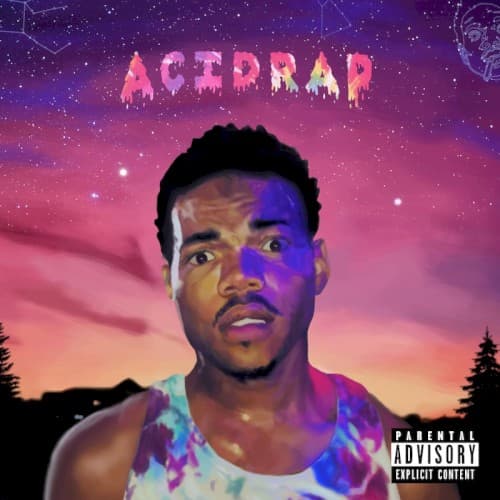
Dripping title lettering
The melting text represents consciousness dissolving under psychedelic influence while maintaining childlike wonder.
Shirtless vulnerability
His bare chest signals raw honesty and spiritual openness central to the mixtape's confessional nature.
Starry cosmic sky
The celestial backdrop positions Chicago's South Side struggles within universal, infinite context and possibility.
Where Sound Meets Image
The purple-pink gradient mirrors the album's tonal shifts between Acid's paranoid darkness and Cocoa Butter Kisses' nostalgic warmth. Chance's upward gaze matches the spiritual seeking in Everybody's Something and the gospel-sampling throughout. The dripping letters visualize how tracks like Juice blur reality through production that sounds simultaneously crisp and warped. The vulnerable shirtless pose reflects confessional lyrics about family struggles, drug use, and finding purpose, while the cosmic backdrop captures guest features from Ab-Soul and Action Bronson expanding the sonic universe beyond Chicago.
The cover established psychedelic optimism as viable hip-hop aesthetic during drill's bleakest moment, influencing subsequent Chicago artists to embrace colorful experimentation. Its success as independent visual branding proved rappers could compete without major label design budgets. The tie-dye lettering became Chance's visual signature, appearing on merchandise and tour visuals for years. Travis Scott's Rodeo and Kid Cudi's later work borrowed similar cosmic-meets-portrait compositions, validating the approach.