Style & Context
Influences
Blue Note jazz album covers, Gordon Parks portraiture, Marvin Gaye soul records
Location
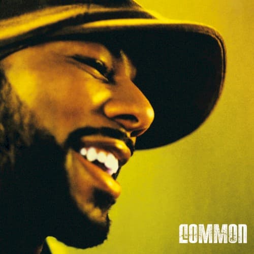
This cover represents Chicago's intellectual South Side tradition, where Common came up studying with peers pushing rap beyond gangsta narratives.
Visual Language
The intimate framing and monochromatic lighting recall classic soul and jazz photography from Chicago's rich musical history.
Symbols
Upward gaze and open smile
Common looks beyond the frame toward higher consciousness, embodying the spiritual searching that defines conscious rap's mission.
Baseball cap in shadow
The everyman headwear connects Common to Chicago's working-class roots while the shadow suggests leaving street life behind.
Visible gold tooth
The single flash of gold balances street credibility with the album's rejection of materialism as life's purpose.
Where Sound Meets Image
The warmth radiating from Common's face mirrors Kanye's soul-drenched production throughout Be. Tracks like 'The Corner' and 'Go!' balance street realism with uplift, just as this image balances the cap's street signifier with transcendent joy. The intimate framing matches the album's personal storytelling—'Testify' and 'It's Your World' feel like conversations, not performances. That golden light is the same warmth heard in J Dilla's drums and the Church choir samples, creating visual-sonic unity.
This cover helped establish minimalist portraiture as credible in hip-hop, proving rappers didn't need props to command attention. The approach influenced a wave of introspective artists who prioritized substance over spectacle in their visual presentation. It remains a reference point for how to communicate artistic maturity—the image ages beautifully because genuine emotion never goes out of style, while flashier 2005 covers now look dated.