Style & Context
Influences
Blue Note jazz records, protest photography, African American spiritual imagery
Location
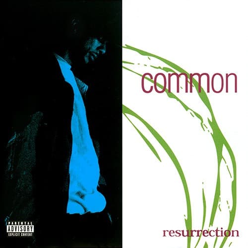
The cover reflects Chicago's South Side reality while reaching toward transcendence through knowledge and consciousness.
Visual Language
The photographic silhouette technique echoes jazz album aesthetics that influenced Common's sound throughout this project.
Symbols
Blue silhouette figure
The glowing figure represents the artist's soul emerging from darkness into conscious awareness.
Grass blades on white
Fresh growth symbolizes Common's evolution from gangsta rap persona to thoughtful lyrical craftsman.
Split composition
The vertical divide represents the choice between destructive paths and life-affirming resurrection.
Where Sound Meets Image
The shadow-to-light progression mirrors the album's narrative arc from street struggles to enlightenment through knowledge of self. The grass imagery connects directly to the organic, live-instrumentation sound No I.D. crafted for tracks like 'I Used to Love H.E.R.' where Common personifies hip-hop culture itself. The contemplative silhouette posture reflects the introspective lyricism throughout the album, where Common examines relationships, culture, and personal growth with unprecedented vulnerability for a male rapper in 1994.
This cover established the visual language for conscious hip-hop album art, proving that depth and minimalism could compete with flashy street imagery. The stark duality influenced countless covers that used visual contrast to represent artistic transformation. The integration of natural elements into hip-hop imagery became a template for artists seeking to distance themselves from materialism while maintaining street credibility.