Style & Context
Influences
Gordon Parks, Jamel Shabazz, 1990s album realism, war photography framing
Location
Buffalo's East Side becomes visual shorthand for Rust Belt resilience and systematic abandonment.
Visual Language
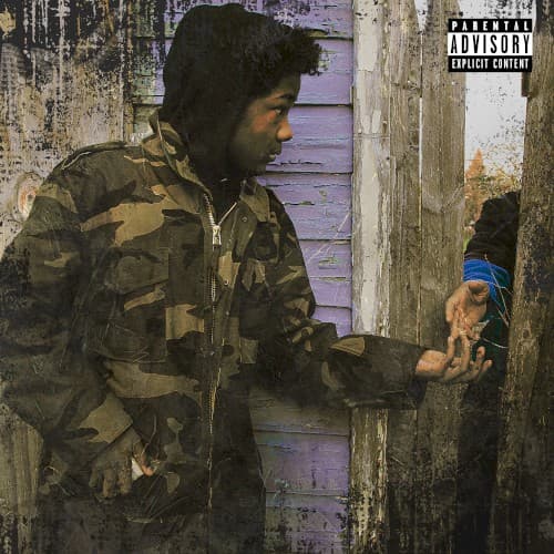
The composition treats urban decay with the gravity of war correspondence, refusing to beautify poverty.
Symbols
Camouflage jacket
Conway blends into hostile terrain, a soldier navigating streets that demand constant warfare mentality.
Peeling lavender boards
Beauty deteriorates but persists, much like the communities that raised Buffalo's Griselda movement.
Profile positioning
The side view suggests watchfulness, never fully exposed, always scanning for threats or opportunities.
Where Sound Meets Image
The deteriorating wood textures mirror Daringer's dusty, crackling production throughout the album. Conway's storytelling moves between reflection and aggression, matching how this image balances stillness with the camouflage's military implications. The child visible behind weathered boards connects to tracks addressing generational trauma and legacy, while the muted color scheme reflects the album's refusal to chase radio-friendly sounds. The title's spiritual certainty meets visual evidence of abandonment, creating the same philosophical tension Conway explores across these songs.
The cover reinforces Griselda's visual identity: no flexing, no chains prominently displayed, just the architecture of struggle. It influenced a wave of rap photography that treats urban blight as subject matter worthy of artistic consideration rather than backdrop to be escaped. The naturalistic approach pushed back against the CGI-heavy, surrealist covers dominating streaming platforms, arguing that unvarnished reality carries its own aesthetic power when framed with intention.