Style & Context
Influences
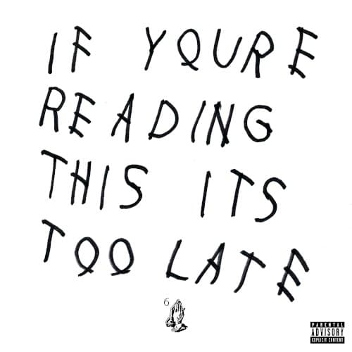
Street art, personal notes, digital communication, raw DIY aesthetic
Location
The cover, through the '6' emblem, strongly roots Drake's persona in Toronto, solidifying his identity as the city's reigning voice.
Visual Language
The raw, handwritten aesthetic intentionally feels personal and immediate, mirroring the directness of social media communication prevalent in the era.
Symbols
Handwritten text
The crude, urgent lettering conveys a sense of authenticity and direct, unfiltered communication from Drake to his loyal fanbase.
Praying hands emoji
The small praying hands symbolize gratitude, aspiration, and a plea for blessings or forgiveness amidst the pressures of fame.
The number '6'
The subtle '6' represents Drake's deep connection to Toronto, often dubbed 'The 6', grounding his global appeal in local roots.
Where Sound Meets Image
The album's sound, characterized by minimalist trap beats and Drake's introspective, often melancholic delivery, perfectly aligns with the cover's stark visual. Tracks like 'Energy' and 'Know Yourself' convey a sense of paranoia, ambition, and a need for loyalty, echoing the cover's 'too late' warning and its almost confessional tone. The raw, unfiltered aesthetic mirrors the album's direct lyrical approach, where Drake lays bare his thoughts on success, betrayal, and the isolation of his elevated status, making the entire package feel like a personal dispatch to the listener.
This cover redefined what an album visual could be, prompting a wave of minimalist, text-based designs across hip-hop and beyond. It demonstrated that a powerful message, delivered with stark simplicity, could be more impactful than elaborate imagery. Its influence solidified the concept of the 'mixtape as an album' visual, inspiring artists to embrace raw, unfiltered aesthetics for their projects.