Style & Context
Influences
classic soul album art, family photography, minimalist design
Location
The cover subtly evokes a sense of Toronto's understated confidence, mixing local roots with international appeal.
Visual Language
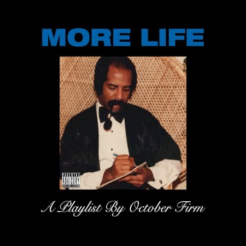
This cover employs staged vintage photography, framing a personal moment within a sleek, modern, minimalist presentation, echoing classic album design.
Symbols
Dennis Graham
Featuring his father signifies lineage, personal heritage, and the passing of a suave, cool-headed musical tradition within his family.
Writing in notebook
The act of writing symbolizes artistic creation, thoughtful reflection, and the meticulous crafting of lyrics or musical ideas.
Smoking pipe
The pipe suggests an aura of refined contemplation, intellectual depth, and a connection to a more mature, classic aesthetic.
Where Sound Meets Image
The reflective image of Dennis Graham writing perfectly aligns with "More Life's" introspective tracks, such as the soulful "Since Way Back." The cover's global yet classic aesthetic mirrors the album's diverse soundscape, which seamlessly blends UK grime, dancehall, and Afrobeats with atmospheric trap bangers. This visual suggests a project that is both deeply personal and globally expansive, much like the "playlist" itself, connecting its diverse sonic influences.
The "More Life" cover reinforces Drake's brand of sophisticated minimalism, setting a trend for personal, nostalgic imagery in hip-hop art. It solidified the "playlist" concept's visual identity, influencing other artists to experiment with album packaging beyond traditional LPs. Its unexpected choice of subject matter maintains its intrigue, ensuring it remains a recognizable visual within Drake's catalog.