Style & Context
Influences
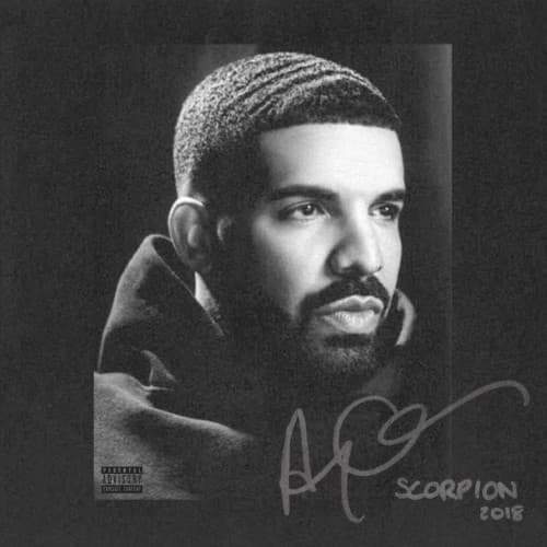
Classic portraiture, minimalist album art
Location
The understated aesthetic avoids overt references to a specific Toronto neighborhood, instead projecting a universal, global superstar's internal struggle.
Visual Language
The cover employs direct portrait photography, focusing solely on the artist to convey a sense of personal vulnerability and direct address.
Symbols
Drake's Waves
The meticulously groomed waves signify discipline, self-care, and a polished presentation often associated with Black male identity in hip-hop.
Hoodie
The simple hooded sweatshirt suggests humility, approachability, and a return to roots, contrasting with typical flashy rap imagery.
Distant Gaze
Drake's eyes look away, conveying introspection, isolation, and the weight of constant public scrutiny on his personal life.
Where Sound Meets Image
The somber, reflective portrait perfectly sets the stage for Scorpion's dual nature, encompassing both rap and R&B. Drake's distant gaze mirrors introspective tracks like "Emotionless" and "March 14," where he delves into fatherhood and past relationships. This understated visual prepares listeners for an album full of internal conflict and the burdens of his superstardom, rather than pure celebration.
The Scorpion cover solidified a trend of high-profile artists opting for minimalist, personal portraits over flashy concepts, influencing subsequent covers that aimed for vulnerability. Its elegant simplicity demonstrated that true star power didn't require elaborate visuals, just a direct connection through an artist's unadorned image. It reinforced the idea that sometimes the most powerful statement is the most stripped-down.