Style & Context
Influences
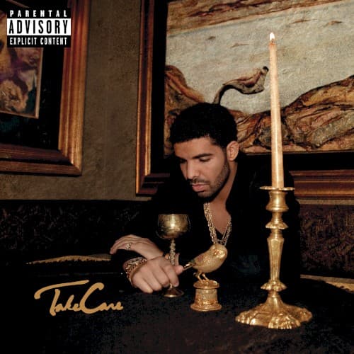
Renaissance portraiture, Dutch Golden Age still life
Location
The opulent, somewhat dated setting subtly reflects Toronto's understated luxury, a city emerging as a distinct cultural force from traditional hip-hop hubs.
Visual Language
The photographic style adopts a chiaroscuro lighting technique, emphasizing depth and emotional weight through strong contrasts between light and shadow.
Symbols
Golden Chalice
The chalice represents a bittersweet taste of success, hinting at the intoxicating yet isolating nature of fame and wealth within the rap game.
Owl Figurine
This is a direct nod to OVO Sound, symbolizing wisdom, nocturnal musings, and a watchful presence over Drake's burgeoning empire.
Lit Candle
The flickering flame suggests a fleeting moment of contemplation or an inner light guiding Drake through the darkness of his thoughts and celebrity.
Where Sound Meets Image
The cover visually mirrors the album's thematic duality of celebratory success and profound melancholy. Tracks like "Marvins Room" and "Doing It Wrong" delve into the isolation and regret that success can bring, directly echoed by Drake's solitary pose amidst wealth. The atmospheric, moody production style that defines the album is palpable in the cover's dim lighting and somber color palette. It perfectly sets the stage for an album that explores fame's emotional toll, from longing for past loves to the constant pressure of maintaining a burgeoning empire.
This cover helped solidify a visual aesthetic for introspective, "sad boy" hip-hop, influencing a generation of artists who blended luxury with vulnerability in their visuals. Its deliberate composition and symbolic depth elevated album art's role in conveying complex emotional narratives within the genre. The mood it established became a blueprint for artists exploring similar themes of isolation and the bittersweet nature of success.