Style & Context
Influences
Nan Goldin intimacy, Saul Leiter abstraction, DIY punk aesthetics, experimental film stills
Location
Reflects Los Angeles underground rap's embrace of jazz samples and abstract production pioneered by Odd Future's aftermath.
Visual Language
The technique rejects commercial hip-hop's obsession with clarity and brand presentation in favor of raw emotional documentation.
Symbols
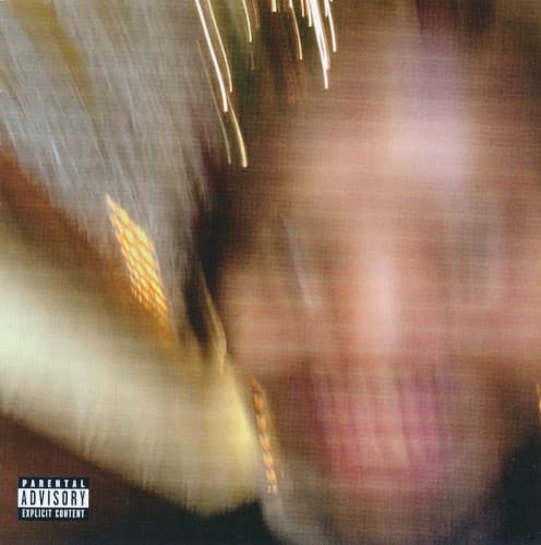
Motion blur effect
The deliberate unfocus represents dissociation and the way depression makes the world feel distant and unreal.
Brass instrument streaks
Jazz heritage bleeds through distortion, connecting Earl's father's musicianship to his own fractured sonic experiments.
Extreme close-up framing
Claustrophobic proximity suggests the inescapable nature of grief and the inability to gain perspective on pain.
Where Sound Meets Image
The visual blur directly parallels the album's dense, layered production where samples overlap like traumatic memories. Just as the cover refuses focus, tracks like 'Azucar' and 'The Mint' bury Earl's voice beneath distorted jazz loops and crackling vinyl noise. The warm tones match the album's soul and funk samples, while the motion suggests the racing thoughts and time distortion described throughout. The saxophone streaks reference Earl's father, poet Keorapetse Kgositsile, whose absence haunts the record.
The cover helped normalize anti-commercial aesthetics in streaming-era hip-hop, proving albums could succeed without recognizable artist images or title text. Its blur technique influenced subsequent alternative rap visuals that prioritize mood over clarity, from MIKE's productions to Navy Blue's releases. The design validated bedroom rap's DIY ethos, showing major labels would accept genuinely experimental presentation from artists with earned credibility.