Style & Context
Influences
Corporate headshots, music equipment catalogs, b-boy culture
Location
Long Island's emerging scene challenging New York City's dominance in East Coast production aesthetics.
Visual Language
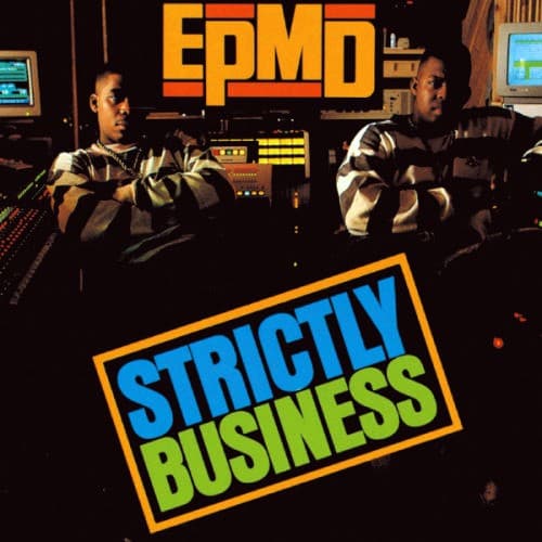
The direct photographic approach rejects stylization in favor of documentary realism about production work.
Symbols
Studio equipment backdrop
The visible samplers and mixing boards position EPMD as technicians and craftsmen, not just performers.
Crossed arms stance
This defensive posture projects authority and self-assurance, establishing the duo as equals in their partnership.
Leather jackets
The matching attire signals unity and professionalism without the ostentatious gold chains dominating other covers.
Where Sound Meets Image
The studio setting directly reflects the album's sample-heavy production style, built from funk and soul loops chopped and reassembled on the visible equipment. The straightforward visual presentation mirrors Erick Sermon and Parrish Smith's no-frills lyrical delivery and uncluttered beats. The title treatment's bold geometry echoes the album's funk-driven rhythms, while the serious expressions match the duo's deadpan flow and business-minded lyrics about the rap game as profession.
This cover helped establish the producer-as-artist visual language that would influence countless boom bap acts. The studio-as-setting template became standard for underground hip-hop, from DJ Premier to Pete Rock, showing the creative workspace as worthy of reverence. The bold sans-serif typography influenced hip-hop graphic design throughout the nineties, proving that simple, confident type could carry as much weight as elaborate illustrations.