Style & Context
Influences
Renaissance religious portraiture, pop surrealism, Saturday morning cartoon aesthetics
Location
Cole positions himself as Fayetteville's conscious alternative to Atlanta and South Florida's pharmaceutical trap sound.
Visual Language
The technique blends classical portraiture's gravitas with modern animation's accessibility, making heavy subjects digestible.
Symbols
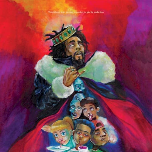
Tilted golden crown
The crown sits askew on Cole's head, suggesting the burden and instability of self-proclaimed royalty in hip-hop.
White fur collar
The luxurious fur represents wealth's false comfort, a soft trap that obscures what lies beneath.
Six cartoon faces
These stylized heads represent different ages or personas, the inner voices Cole protects from addiction's reach.
Where Sound Meets Image
The cover's duality matches KOD's double meanings throughout—Kids On Drugs, King OverDosed, Kill Our Demons. Cole's conflicted expression mirrors his sung hooks questioning his own choices while preaching to others. The cartoon faces echo the album's concern for younger listeners idolizing destructive lifestyles, while the royal imagery connects to tracks about ego and false crowns. The warm-to-cool color gradient visualizes the album's sonic journey from harder production to introspective moments.
This cover helped establish painted portraiture as a viable alternative to photography in modern rap packaging, influencing artists seeking deeper artistic statements. The cartoon integration predicted hip-hop's growing embrace of animation and illustration as serious artistic tools rather than childish gimmicks. Cole's self-design choice reinforced his independent artistic vision, proving rappers could art-direct compelling visuals without major label creative teams.