Style & Context
Influences
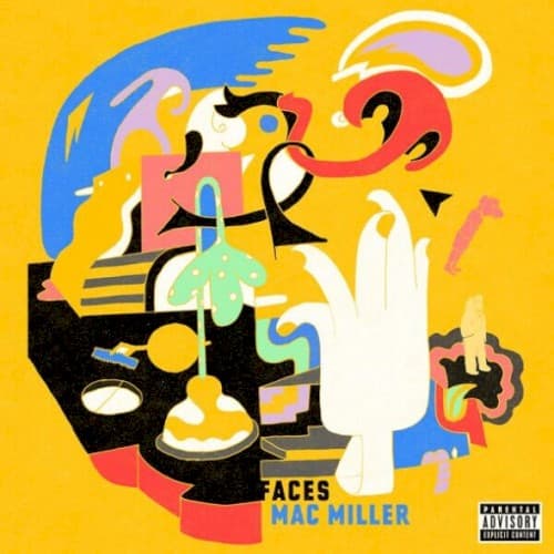
Picasso's cubism, Peter Max psychedelia, underground comix, Basquiat
Location
Pittsburgh's Mac represented a generation rejecting traditional hip-hop masculinity to explore anxiety, depression, and pharmaceutical dependency openly.
Visual Language
The fractured perspective deliberately disorients viewers, forcing them to piece together meaning like Mac assembling his fractured psyche.
Symbols
Turntables and vinyl records
Music production serves as both creative outlet and escape mechanism during Mac's darkest period of isolation.
Fragmented human figures
The disconnected body parts represent psychological fragmentation and the dissolution of identity under substance abuse.
Ghostly white hand reaching upward
The spectral appendage suggests Mac's desperate grasp for salvation or his own mortality haunting the frame.
Where Sound Meets Image
The disjointed visual composition mirrors the mixtape's warped production aesthetic and Mac's stream-of-consciousness flows about drug use and depression. The turntables represent his producer identity (Larry Fisherman), while the fragmented figures echo lyrics about losing himself in substances. The bright yellow contradicts the dark subject matter, just as Mac's melodic delivery often wrapped devastating confessions in accessible hooks. The cubist approach matches how tracks like 'Inside Outside' and 'Polo Jeans' fracture traditional song structures into hallucinogenic segments.
The cover helped normalize mental health representation in hip-hop visual art, proving that commercial appeal didn't require glamorizing the lifestyle being depicted. Its honest portrayal of addiction's chaos influenced how subsequent artists visualized their struggles—think Kid Cudi's later work or Juice WRLD's artwork. The illustration style anticipated hip-hop's move toward abstract, art-gallery-ready covers rather than photographic portraits, paving the way for artists like Tyler, The Creator and Danny Brown to experiment with surrealist imagery.