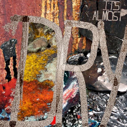
Style & Context
Influences
Industrial photography, street art aesthetics, brutalist design, evidence documentation
Location
This visual language speaks to post-industrial American cities where economic abandonment created the conditions for underground economies to flourish.
Visual Language
The extreme close-up of corroded material creates abstract beauty from decay, forcing luxury consumption and street destruction into uncomfortable coexistence.
Symbols
Corroded metal typography
The oxidized letters represent how time and chemical exposure erode everything in the drug trade.
Rust streaks and stains
Vertical orange drips mirror both the album's drying process and decades of narcotics flowing through communities.
Textured, tactile surface
The physical roughness rejects digital polish, insisting viewers confront the material reality of street economics.
Where Sound Meets Image
The title's chemical process metaphor extends throughout an album obsessed with cocaine's transformation from powder to crack to profit. Tracks like 'Brambleton' and 'Diet Coke' detail the drug trade's mechanics with forensic precision, mirrored in the cover's documentary-style attention to material decay. The weathered surface reflects the album's production approach, where Kanye and Pharrell strip beats down to essential elements. The corroded typography matches Pusha's vocal delivery, aged and hardened by two decades of rap's most consistent drug kingpin narratives, refusing nostalgia while acknowledging time's passage.
The cover establishes a visual vocabulary for aging cocaine rappers confronting legacy without romanticization. Its material-focused approach influenced subsequent hip-hop artwork exploring texture and decay over celebrity portraiture. The design demonstrates how minimalist concepts can communicate complex street economics more effectively than literal imagery, expanding possibilities for veteran rappers to address their subject matter's consequences without abandoning their core narratives.