Style & Context
Influences
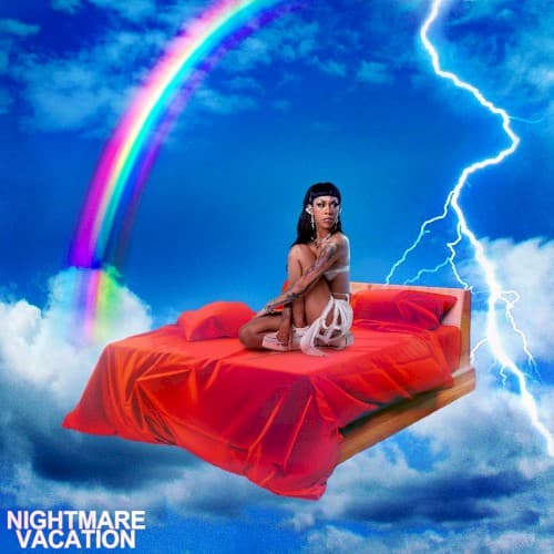
Y2K aesthetics, anime storm scenes, emo MySpace graphics, hyperpop maximalism
Location
The surreal setting rejects specific geographic ties, reflecting how internet-native artists transcend regional scenes entirely.
Visual Language
The digital manipulation creates impossible physics that mirror how Rico's music defies genre boundaries.
Symbols
bed in sky
The floating bed represents vulnerability exposed in public, showing comfort zones destroyed by chaos.
lightning bolts
Jagged electricity symbolizes the unpredictable rage and punk energy coursing through her music.
rainbow arc
The rainbow suggests hope and diversity persisting despite surrounding turbulence and threatening weather.
Where Sound Meets Image
The visual chaos mirrors Nightmare Vacation's genre-hopping production, where hyperpop producer Dylan Brady's glitchy maximalism collides with Rico's punk-rap aggression. The bed suggests the album's introspective moments addressing relationships and mental health, while the storm represents tracks like 'OHFR?' and 'iPhone' where her rage becomes undeniable force. The impossible sky setting matches how the album refuses earthbound genre constraints, floating between emo confessions and mosh-pit anthems. The rainbow's presence hints at the album's occasional melodic sweetness underneath the abrasive exterior.
This cover helped establish hyperpop's surrealist visual vocabulary within mainstream hip-hop, proving that maximalist digital aesthetics could coexist with punk credibility. The image influenced how alternative rap artists visualize emotional extremes, moving beyond simple angry poses to more complex symbolic representations. Rico's willingness to appear vulnerable while surrounded by chaos opened doors for artists exploring mental health within aggressive music contexts.