Style & Context
Influences
Gordon Parks social documentation, Irving Penn minimalism, classic hip-hop press photos
Location
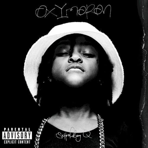
South Central Los Angeles pride emanates through the unapologetic gaze and posture visible throughout the composition frame.
Visual Language
The tight crop and dramatic lighting recall portraiture that prioritizes psychological presence over environmental storytelling completely.
Symbols
Tilted-back head posture
The upward angle projects defiance and refusal to bow, a recurring gesture in West Coast rap imagery.
White bucket hat
The hat references both casual streetwear and creates visual opposition to the darkness surrounding him.
Heavy chain necklace
The thick silver chain represents material success earned from the streets the album chronicles unflinchingly.
Where Sound Meets Image
The stark visual directly parallels Oxymoron's lyrical content—tracks like 'Prescription/Oxymoron' and 'Hoover Street' examine contradictions between addiction and ambition, violence and vulnerability. The upward gaze matches the album's refusal to apologize for its subject matter, while the monochrome palette reflects the moral grayscale Q navigates across fourteen tracks. The minimalist approach lets Q's presence dominate, just as his gravelly delivery and West Coast drawl anchor production ranging from Pharrell's funk to Tyler's darkness.
The cover helped establish TDE's visual identity of stark simplicity over flash, influencing how West Coast artists present authenticity in the streaming era. Its restraint stands in sharp contrast to the colorful cartoon aesthetics dominating 2010s rap, proving powerful photography still resonates. The bucket hat became temporarily synonymous with Q's brand, appearing in countless fan recreations and cementing its place in LA rap fashion history.