Style & Context
Influences
Film noir, 90s action movie posters, underground rave flyers, Wu-Tang visual aesthetics
Location
The Bucktown representation is pure mid-90s Brooklyn, when neighborhoods developed distinct rap identities and crews moved as unified forces.
Visual Language
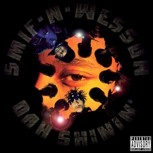
The cover employs dramatic chiaroscuro and circular composition to create psychological pressure that matches the album's claustrophobic production.
Symbols
Circle of silhouettes
This ring of shadowy figures represents the crew mentality essential to surviving Brooklyn's Bucktown in the mid-90s.
Central illuminated face
The lone face emerging from darkness symbolizes individual identity struggling to remain visible within collective street life.
Light sources within circle
These glowing points suggestgunfire muzzle flashes or the spark of consciousness in an environment demanding constant vigilance.
Where Sound Meets Image
The encircling figures mirror the album's claustrophobic, bass-heavy production style, where drum loops and samples create tight sonic spaces. The orange-yellow glow reflects the warmth of the SP-1200 drum sounds and dusty soul samples that define tracks like 'Bucktown' and 'Wrekonize.' The cover's refusal to show clear faces parallels the album's focus on collective street knowledge over individual celebrity, with lyrics that speak from and for the crew rather than glorifying solo exploits.
This cover influenced how independent East Coast labels would package street rap throughout the late 90s, proving that raw visual concepts could match raw sonic aesthetics. The silhouette technique became shorthand for underground authenticity, copied by countless mixtape covers and regional releases. Its rejection of the era's typical rapper-posing-with-props approach helped establish an alternative visual vocabulary for artists prioritizing substance over commercial appeal.