Style & Context
Influences
documentary photography, Jamel Shabazz, street portraiture, 1970s soul album aesthetics
Location
Brooklyn institutions like barbershops served as town halls where political ideas, cultural criticism, and neighborhood history circulated freely.
Visual Language
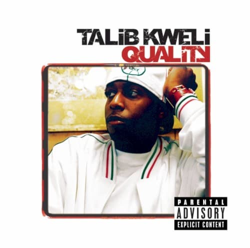
The unstaged composition feels lifted from a neighborhood photo album, prioritizing authenticity over commercial polish.
Symbols
Barbershop mirror
The reflective surface captures both Kweli and another figure, representing the communal dialogue central to conscious hip-hop.
White turtleneck
The clean, minimalist clothing rejects flashy materialism, aligning Kweli with intellectual sophistication over street luxury.
Sunglasses indoors
The shades suggest contemplative distance, a thinker observing his world rather than performing for cameras.
Where Sound Meets Image
The unpretentious visual mirrors Quality's sonic approach—Kweli rapping over warm soul samples and live instrumentation, addressing gentrification, police violence, and personal growth without industry posturing. Tracks like 'The Proud' and 'Get By' balance struggle and hope, matching the cover's reflective mood. The doubled image in the mirror suggests the album's conversational tone, Kweli engaging listeners as equals rather than preaching from above. Just as the cover finds beauty in unglamorous spaces, the music elevates everyday survival into art.
This cover influenced a generation of independent artists who chose documentary-style photography over constructed imagery. The barbershop setting became shorthand for authentic community connection in hip-hop visuals, while the faded color treatment suggested depth and history. The design proved powerful music didn't require expensive production—that a well-composed photograph from the neighborhood could communicate values more effectively than any studio concept.