Style & Context
Influences
Glitch art, lo-fi aesthetics, nature documentary cinematography, vaporwave degradation
Location
Long Beach's proximity to the Pacific Ocean makes aquatic imagery locally resonant while commenting on geographic limitation.
Visual Language
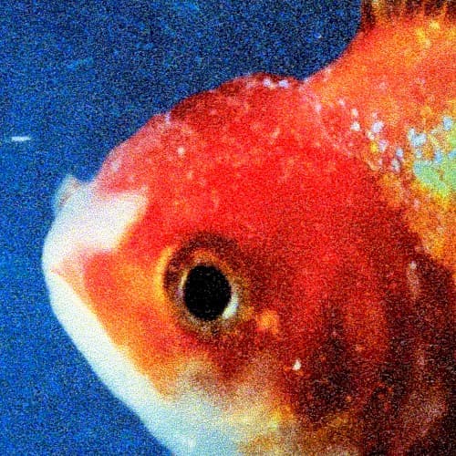
The deliberately degraded image quality functions as sonic metaphor for Big Fish Theory's distorted basslines and harsh textures.
Symbols
Goldfish eye
Represents constant observation and the performer's experience of being watched in the fishbowl of fame.
Close-up framing
The suffocating composition mirrors feeling trapped in Long Beach's limited opportunities and cyclical violence.
Water distortion
Symbolizes how perception gets warped through screens, media filters, and societal expectations of Black artists.
Where Sound Meets Image
The distorted, grainy visual directly parallels the album's industrial production featuring UK garage, grime, and Detroit techno influences over traditional West Coast sounds. Tracks like 'Big Fish' and 'Yeah Right' explore themes of being commodified and watched, which the extreme close-up of a fish eye makes literal. The cold electronic palette matches features from Kilo Kish, Kendrick Lamar, and production from GTA and Jimmy Edgar that strip away warmth for mechanical precision. The aquatic theme extends Staples' water imagery from Summertime '06 while the degraded aesthetic reflects his skepticism about digital connection.
The cover helped establish minimalist, conceptual design as viable for experimental rap albums during trap's visual dominance of luxury brands and street imagery. Its rejection of human figures and recognizable locations influenced subsequent alternative hip-hop covers that prioritize metaphor over literal representation. The lo-fi aesthetic anticipated the DIY visual language that would dominate SoundCloud rap and underground scenes, proving major label releases could embrace visual degradation as artistic choice rather than technical limitation.