Style & Context
Influences
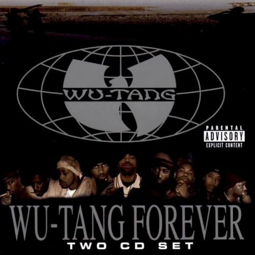
Corporate logos, military insignia, chess strategy imagery, Nation of Gods and Earths symbolism
Location
This design reflects Staten Island's Shaolin mentality translated into global business terms, showing how the Clan maintained their insular mystique while expanding worldwide.
Visual Language
The cover merges boardroom corporate branding with street-level militancy, treating the Wu logo like a Fortune 500 trademark while maintaining underground grit.
Symbols
Wu-Tang globe logo
The wireframe globe positions the Clan as a worldwide movement, extending their Staten Island origins across every continent and meridian line.
Members in shadow
Faces obscured in darkness prioritize collective identity over individual celebrity, reinforcing the Clan's hive-mind philosophy and united front.
Parental Advisory sticker
The explicit content label sits prominently as a badge of authenticity, signaling uncompromised rawness despite their commercial expansion.
Where Sound Meets Image
The austere visual perfectly matches the album's dense, layered production and the Clan's refusal to simplify their sound for mainstream consumption. Just as the cover presents nine distinct figures merging into shadow, the double album sprawls across 27 tracks where individual personalities blur into the collective Wu sound. The metallic globe reflects RZA's cosmic production approach, layering soul samples with martial arts dialogue and chess strategy, creating a sonic world as complex as the cover's implied global reach. The darkness engulfing the members mirrors tracks exploring mortality, street warfare, and spiritual mathematics.
This cover established a template for hip-hop collectives presenting themselves as movements rather than mere groups, influencing everyone from Odd Future's early branding to Griselda's current aesthetic. The globe logo became one of hip-hop's most recognizable symbols, launching a merchandising empire that outlasted many flashier contemporaries. By rejecting colorful excess for monochrome authority, Wu-Tang Forever proved that mature, serious design could sell millions while maintaining underground credibility.