Style & Context
Influences
Grunge album aesthetics, indie rock minimalism, early Nirvana visuals
Location
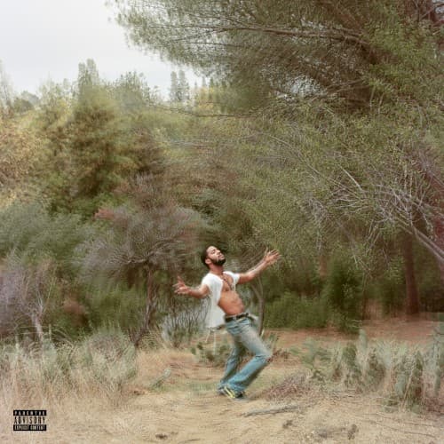
The isolated nature setting symbolizes Cudi's complete departure from urban hip-hop spaces and Cleveland roots.
Visual Language
The deliberately degraded image quality mirrors the album's raw punk and grunge influences perfectly.
Symbols
Suspended figure mid-leap
The frozen moment represents Cudi's state between falling into darkness and reaching for something higher.
Sparse pine forest
The isolated wilderness reflects his self-imposed exile from mainstream hip-hop and personal relationships.
Bare dirt path
The barren ground symbolizes the stripped-down, unpolished approach Cudi took abandoning hip-hop production.
Where Sound Meets Image
The grainy, low-fidelity photography directly mirrors the album's lo-fi production and distorted guitars. Cudi's suspended motion matches the disorienting, unstructured songs that abandoned traditional hip-hop formats for punk rawness. The isolation visible here echoes lyrics about depression, suicide, and disconnection throughout the double album. The natural setting connects to Cudi's attempt to find peace outside the music industry's pressures.
This cover became a visual marker for hip-hop's mental health conversation, arriving before vulnerability became mainstream in rap. The DIY aesthetic influenced how artists could present raw emotional states without polish or glamour. It stands as a document of an artist's public breakdown and creative risk-taking, for better or worse in critical reception.