Style & Context
Influences
Renaissance portraiture, blaxploitation film posters, religious iconography, documentary street photography
Location
This visual language spoke directly to Yonkers housing projects where survival meant daily spiritual and physical battles.
Visual Language
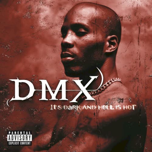
The theatrical lighting and upward angle borrow from classical portraiture while grunge textures anchor it in 90s design aesthetics.
Symbols
Bare torso
The exposed chest symbolizes emotional transparency and street vulnerability that defined DMX's confessional style.
Upward gaze
Eyes lifted toward an unseen presence suggest DMX's constant dialogue with God amid hellish circumstances.
Corroded texture
The degraded surface mirrors how street life erodes both physical structures and human souls.
Where Sound Meets Image
The corroded textures visually represent DMX's gravelly bark and the album's murky, sample-heavy production. His skyward gaze connects to tracks like 'Prayer' where he directly addresses God between street narratives. The claustrophobic red atmosphere mirrors songs about entrapment in criminal cycles and spiritual warfare. The minimal, confrontational composition reflects the album's sparse, aggressive sonic approach where X's raw delivery dominated over beats.
This cover established that debut albums could lead with vulnerability rather than bravado, influencing how artists like 50 Cent and The Game presented themselves. The distressed aesthetic became a template for street rap packaging throughout the 2000s. Its rejection of the era's chrome-and-diamonds visual language helped shift hip-hop imagery back toward authenticity, proving that raw honesty could sell millions without commercial compromise.