Style & Context
Influences
Film noir lighting, presidential portraiture, fashion editorial photography
Location
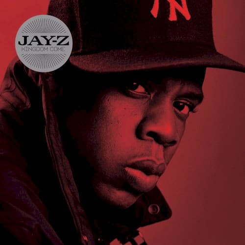
The Yankees cap roots the image in Marcy Projects and the Bronx simultaneously, never letting corporate JAY-Z forget street JAY-Z.
Visual Language
The technique borrows from how power gets photographed—politicians on magazine covers, CEOs in annual reports—then filters it through street elegance.
Symbols
New York Yankees fitted cap
The cap serves as crown and borough flag simultaneously, marking territorial claim to both the game and the city.
Upward gaze into distance
His eyes look beyond the frame toward horizons only an emperor sees, suggesting vision that extends past the present moment.
Crimson color field
The red functions as both warning and coronation backdrop, announcing his return carries both danger and celebration.
Where Sound Meets Image
The restrained visual mirrors the album's mature themes of retirement regret, industry politics, and legacy preservation. Where previous JAY-Z covers showcased flash and ambition, this one offers reflection—the red glow feels like the embers of a fire still burning rather than fresh flames. The upward gaze connects to tracks about surveying what he built, while the shadow play reflects the album's tension between wanting to reclaim the throne and questioning whether he ever truly left. The regal framing supports Kingdom Come's central metaphor of royalty returning to reclaim territory lost during absence.
This cover helped establish the less-is-more approach for comeback albums, proving that returning legends could command attention through presence alone rather than visual spectacle. The monochromatic color treatment influenced how hip-hop would use single-color washes to convey mood—a technique now ubiquitous in streaming-era album art. Its portrait-as-power-statement formula became template for elder statesmen of the genre, showing how to age gracefully in album packaging while maintaining street authenticity through carefully chosen signifiers like the fitted cap.