Style & Context
Influences
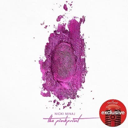
Andy Warhol's commercial art, CSI aesthetics, MAC Cosmetics campaigns
Location
The cover reflects Minaj's Queens roots through its no-filter directness, stripping away Hollywood gloss for raw truth.
Visual Language
The cover employs luxury cosmetics photography techniques but subverts the genre's perfection with deliberate chaos and mess.
Symbols
Thumbprint
The fingerprint serves as Minaj's literal signature, claiming authorship over her most personal work yet.
Powder texture
The crushed makeup aesthetic references beauty industry pressures while subverting them into artistic medium.
White background
The clinical emptiness strips away all the wigs, costumes, and characters Minaj typically hides behind.
Where Sound Meets Image
The destroyed beauty product perfectly mirrors the album's confessional tracks like All Things Go and Bed of Lies, where Minaj discusses her father's addiction and romantic heartbreak without her usual character armor. The pink-to-magenta color shift represents the sonic palette blending hip-hop aggression with R&B vulnerability. The thumbprint as both evidence and signature reflects lyrics oscillating between claiming power and admitting weakness, the duality that defines the project's emotional landscape.
The Pinkprint cover influenced a wave of minimalist hip-hop artwork prioritizing conceptual clarity over visual maximalism, proving female rappers could sell vulnerability as effectively as fantasy. The forensic beauty aesthetic became a template for artists balancing pop accessibility with artistic credibility. The cover's success validated stripped-down approaches during hip-hop's transition away from the glossy excess of the early 2010s toward rawer visual presentations.