Style & Context
Influences
Gordon Parks urban documentation, The Wire's opening credits, 1990s Queensbridge album covers
Location
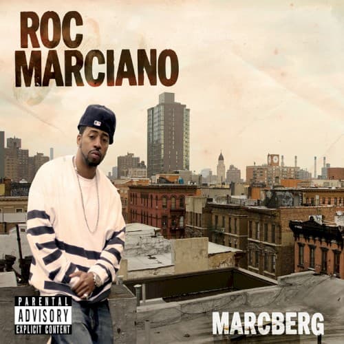
This Brownsville skyline represents pre-gentrification Brooklyn before luxury condos replaced these low-rise projects and tenements.
Visual Language
The grainy, documentary-style photograph rejects digital polish for raw realism that matches Marciano's unadorned production aesthetic.
Symbols
Water towers on rooftops
These quintessential Brooklyn landmarks anchor the cover in outer-borough authenticity that Manhattan skylines cannot claim.
Striped long-sleeve shirt
The horizontal stripes subtly echo prison uniforms while maintaining street fashion credibility through casual layering.
Rooftop vantage point
Marciano surveys his territory from above like a kingpin overseeing operations across the borough's rooftops.
Where Sound Meets Image
The stark, uncluttered composition mirrors Marciano's revolutionary minimalist production, where bare drums and dusty loops create maximum space for his intricate wordplay. The washed-out color palette matches the album's lo-fi aesthetic and vintage sample choices. Marciano's solitary stance reflects his isolated auteur approach, producing and rapping without features or co-signs. The rooftop setting connects to his street-level mafioso narratives about moving work across Brooklyn's rooftops and back alleys.
Marcberg's cover established the visual template for the 2010s underground renaissance, proving street rap could strip away all commercial signifiers and still command respect. Griselda Records would adopt this exact aesthetic, from Westside Gunn's Buffalo street photography to Conway's project rooftop shots. The sepia-toned, gritty location photography became the anti-mainstream badge of honor for an entire generation of independent East Coast MCs who prioritized bars over commercial appeal.