Style & Context
Influences
Comic book superhero art, baroque portraiture, fitness magazine photography, street fashion advertising
Location
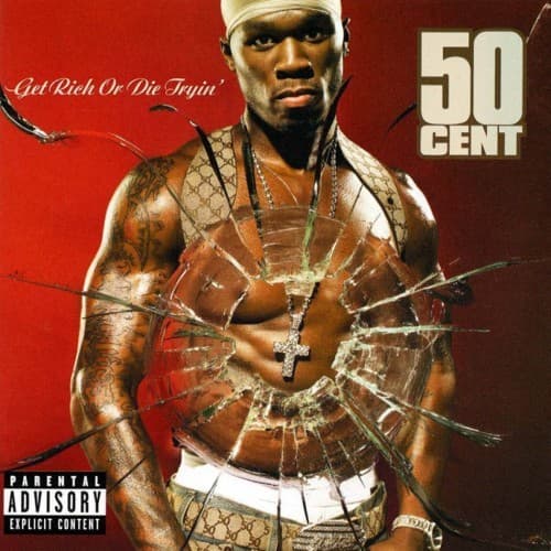
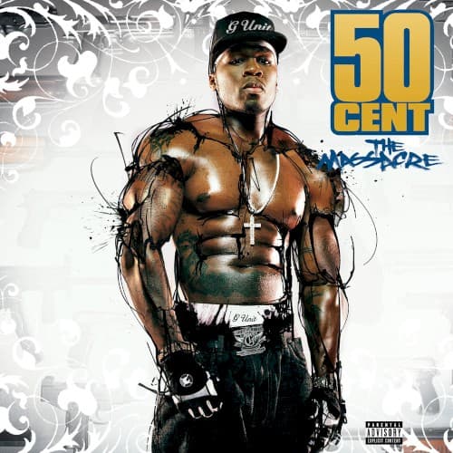
This cover represents Queens street credibility packaged for mainstream consumption, the G-Unit empire at maximum expansion beyond borough boundaries.
Visual Language
The cover blends bodybuilding magazine aesthetics with hip-hop street photography, then overlays it with decorative graphics borrowed from luxury branding.
Symbols
Exaggerated musculature
The digitally enhanced physique represents 50's nine-shot survival story made flesh, turning his body into living armor.
Ornamental flourishes
Baroque decorative elements frame the street soldier like Renaissance portraiture, elevating gangsta rap to high art status.
G-Unit baseball cap
The branded headwear anchors his crew identity while keeping the focus on raw physical presence below.
Where Sound Meets Image
The cover's combination of raw physicality and polished production mirrors The Massacre's sonic blend of menacing g-funk beats with radio-ready hooks. His confrontational stance and battle-scarred torso visualize tracks about street warfare and crew dominance, while the decorative gold elements and clean design reflect club anthems like 'Candy Shop' that prioritized commercial appeal. The survivalist imagery connects directly to 50's lyrical themes of overcoming enemies and critics through sheer force of will.
This cover established the template for presenting rappers as larger-than-life figures through digital enhancement rather than photographic realism alone. The baroque framing device influenced how hip-hop artists would blend street aesthetics with luxury branding in subsequent years, making ornamental design elements standard in rap album packaging. It represents the peak of mid-2000s album art excess before minimalist trends took over.