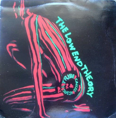
Style & Context
Influences
Swiss minimalism, spiritual philosophy texts, early house music sleeves, Afrocentric symbolism
Location
The design reflects Native Tongues collective values—intellectualism, spirituality, and conscious messaging—that felt increasingly marginal by 1998.
Visual Language
The design strips album art to its conceptual essence, prioritizing message over spectacle in a marketplace saturated with excess.
Symbols
Circular symbols at bottom
These medallion-like emblems likely represent universal concepts or Afrocentric spiritual iconography that ATCQ explored throughout their career.
Lowercase title treatment
The humble lowercase letters reject ego and hierarchy, embodying the album's message of unity and collective love.
White negative space
The vast emptiness symbolizes meditation, mental clarity, and the sonic space jazz rap creates between beats.
Where Sound Meets Image
The sparse visual perfectly mirrors the album's smoother, more reflective production style compared to earlier ATCQ work. Where previous covers featured vibrant colors and playful imagery, this maturity matches songs exploring love, spirituality, and social consciousness. The design's restraint echoes Q-Tip's more measured flows and the jazz-influenced production's emphasis on space and breathing room. The circular symbols might represent the album's exploration of cyclical spiritual concepts and the eternal nature of love as a transformative force.
This cover influenced a generation of alternative hip-hop artists to embrace minimalism as a visual philosophy. Its rejection of the genre's visual clichés validated artistic restraint, proving album art could communicate depth through absence rather than presence. The design helped establish that conscious rap could visually distinguish itself from mainstream excess, creating a template still used by thoughtful hip-hop artists today.