Style & Context
Influences
Blackletter typography, religious imagery, late-nineties digital art
Location
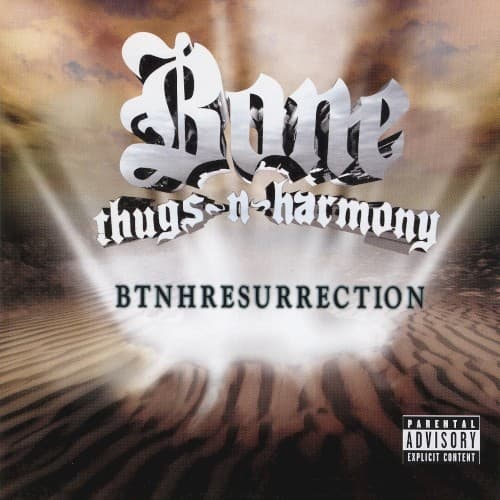
The group's Cleveland roots are not shown, the setting is an abstract desert landscape.
Visual Language
Metallic lettering over a glowing landscape blends gothic type with a cinematic, spiritual backdrop.
Symbols
Radiating light
Beams bursting from the dunes evoke a divine awakening, matching the album's resurrection theme.
Desert dunes
Barren, rippled sand suggests a wilderness crossed before the group's return.
Chrome gothic logo
Blackletter-style lettering ties the group to their established identity while the metallic finish makes it feel renewed.
Where Sound Meets Image
BTNHResurrection carries the group's trademark melodic, rapid-fire vocals alongside themes of faith, loss and perseverance. The title track and the single "Resurrection (Paper, Paper)" fit the idea of returning after a gap. The glowing dune imagery matches that mix of hope and weariness.
The chrome gothic logo and heavenly light became a recognizable visual shorthand for the group's late-period identity. It remains a distinctive example of how rap packaging used spiritual imagery at the turn of the millennium.