Style & Context
Influences
Concert documentation, punk rock album aesthetics, VHS distortion
Location
The dark, gritty visual language reflects New York's pre-gentrification underground scene where Busta cut his teeth with Leaders of the New School.
Visual Language
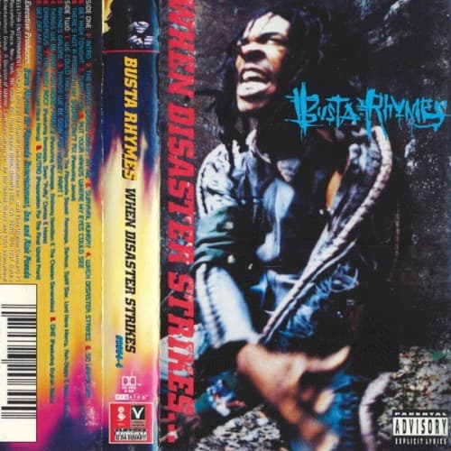
The grainy, high-contrast photography mimics bootleg concert footage, giving the cover an underground authenticity that mainstream rap was abandoning in 1997.
Symbols
Motion blur and dynamic pose
Busta's blurred movement represents his legendary rapid-fire delivery and uncontainable stage presence that defined his solo career.
Dreadlocks in wild disarray
The untamed locs symbolize rebellion against mainstream hip-hop polish, embracing raw, unfiltered artistic expression during boom bap's peak.
Guitar in hand
The instrument bridges hip-hop with live musicianship, nodding to the album's jazz rap influences and Flipmode Squad's genre-bending approach.
Where Sound Meets Image
The visual chaos directly mirrors Busta's schizophrenic flow patterns and the album's apocalyptic themes explored on tracks like the title song. The performance shot captures the same kinetic energy that made 'Put Your Hands Where My Eyes Could See' a cultural phenomenon, while the darkness reflects harder cuts that showcased his hardcore hip-hop credentials. The lack of luxury imagery or posed swagger kept Busta aligned with boom bap's substance-over-style ethos, even as he achieved mainstream success.
This cover helped establish the template for presenting hip-hop artists as raw performers rather than posed fashion plates, influencing the documentary-style artist photography that dominated the early 2000s. The motion-blur aesthetic became shorthand for explosive energy in hip-hop visuals, appearing in countless concert posters and underground mixtape covers.