Style & Context
Influences
Peter Max, Warhol pop art, punk zine culture, children's book illustration
Location
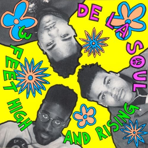
The cover reflects Long Island's suburban perspective—hip-hop made by kids with art school sensibilities.
Visual Language
The cut-and-paste method mirrors the sampling technique that defines the album's sound itself.
Symbols
Inverted portraits
The upside-down positioning challenges listeners to see hip-hop from a completely different angle.
Hand-drawn daisies
Peace movement flowers reclaim hippie optimism for a generation raised on crack-era pessimism.
Mixed typography styles
The chaotic lettering mirrors the album's sample-heavy production and genre-blending approach.
Where Sound Meets Image
The kaleidoscopic visual chaos perfectly mirrors the album's dense sample layering and unpredictable sonic shifts. Songs like 'Eye Know' and 'Potholes in My Lawn' bounce between soul, funk, rock, and spoken word—the cover's competing visual elements capture that same ADD energy. The bright innocence contrasts with sharp social commentary throughout the record, creating the same cognitive dissonance as seeing these flowers next to Pos, Dave, and Maseo's faces. The childlike aesthetic matches their playful wordplay while the collage technique reflects producer Prince Paul's revolutionary cut-and-paste approach to beatmaking.
This cover gave hip-hop permission to embrace color, humor, and visual experimentation beyond street credibility signaling. Its influence echoes through Odd Future's chaotic aesthetics, Chance the Rapper's cartoon mascots, and Anderson .Paak's playful branding. The Native Tongues movement it visually defined—A Tribe Called Quest, Jungle Brothers, Queen Latifah—all adopted similarly creative, non-threatening visuals that expanded rap's commercial possibilities. Modern hip-hop's visual diversity traces directly back to this yellow explosion daring to look different.