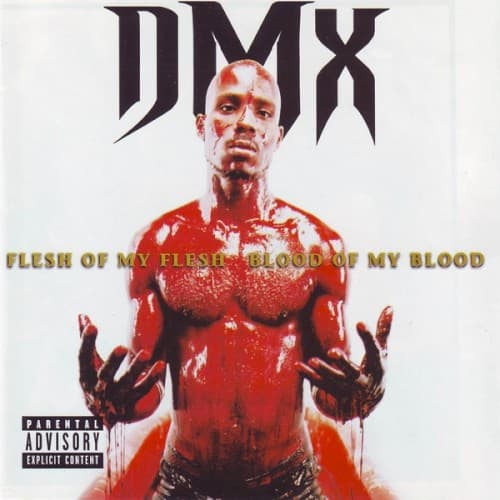
Flesh of My Flesh, Blood of My Blood by DMX — album cover artwork (1998)

Cover Art Analysis

Flesh of My Flesh, Blood of My Blood Album Cover

DMX
Year
1998
Label
Def Jam Recordings
Technique
Studio photography with high-contrast treatment
Mood
Violent, urgent and exposed, with nothing to hide behind.
Colors
Stark white, Blood red, Gold lettering
Era
Late 1990s hardcore rap, when stark, confrontational portraits sold the rawness of street narratives.
🎵 7.2/10🎨 8.0/10Read Full Album Review →

What the Flesh of My Flesh, Blood of My Blood Cover Means

DMX stands shirtless against a stark white background, soaked in blood-red paint with dripping hands raised. The cover is blunt shock imagery, and it matches an album built on violence, faith and raw confession.

Style & Context

  • Influences

    Religious martyr imagery, shock-value album art, late-90s Def Jam styling

  • Location

    No location is visible; the blank white backdrop deliberately strips away any block or borough.

  • Visual Language

    Plain studio lighting and a blank backdrop make the painted-red body the only thing to look at.

Symbols

  • Blood-soaked torso

    Red covering his chest and face turns the title's blood reference into a literal, confrontational image.

  • Open dripping hands

    Palms raised and dripping suggest guilt, surrender or a stigmata-like offering.

  • White void

    The empty background removes place and time, leaving him as a single, isolated figure.

Where Sound Meets Image

The saturated red mirrors an album of violent storytelling, grief and prayer, with tracks such as "The Omen", "Slippin’" and "Ready to Meet Him." The exposed, open-palmed pose also suits the vulnerable moments in his songwriting. The stark presentation matches his rough, barked delivery.

The image became one of DMX's most recognized and still shapes how his breakout era is pictured. Its minimalist shock approach has been echoed by rap releases that favor one striking portrait over busy design.

What You Might Have Missed

  • ◆The red coverage is uneven, heavier on the torso and arms and thinner on the face.
  • ◆The logo uses a sharp, blade-like typeface for DMX at the top, with the "X" mirroring the slashing shapes of the letters.
  • ◆The dripping extends below the hands to the bottom of the frame.

More DMX Album Covers

More Album Covers Explained