Style & Context
Influences
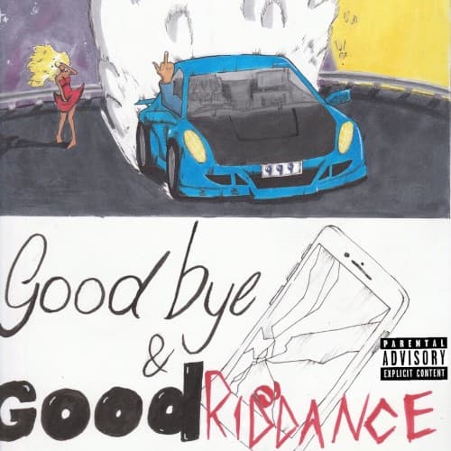
Notebook doodles, SoundCloud DIY aesthetics, XXXTENTACION's raw visual language, teen diary culture
Location
This reflects suburban bedroom producer culture where kids create entire artistic worlds alone with laptops and prescription bottles.
Visual Language
The deliberately unrefined execution mirrors SoundCloud rap's rejection of traditional hip-hop polish and production standards.
Symbols
Blue sports car
Material success can't outrun emotional pain, a vehicle representing both escape fantasy and the isolation fame brings.
Crossed-out text
The visible editing process shows unfinished grief, relationships you can't quite erase no matter how hard you try.
Hand-drawn figures
Deliberate amateurism rejects Instagram perfection, making heartbreak feel immediate and unprocessed like diary entries.
Where Sound Meets Image
The sketch-based visuals perfectly mirror the album's production style, where simple melodic loops support raw emotional outpourings rather than complex lyricism. Just as the cover looks unfinished and bleeding emotion, tracks like 'Lucid Dreams' and 'All Girls Are The Same' feature Juice's pain spilling out over Nick Mira's deliberately sparse beats. The blue car could represent the album's few flexing moments, while the handwritten goodbye captures how most tracks read like voice memos to an ex-girlfriend. The visual fragmentation matches the album's structure as a series of emotional vignettes rather than a cohesive narrative.
This cover helped establish the visual language for emo-rap's mainstream moment, proving that vulnerability could sell without traditional hip-hop imagery of wealth and power. The notebook aesthetic influenced countless SoundCloud-era artists who adopted handwritten text and crude sketches as authenticity markers. After Juice WRLD's tragic 2019 death, the goodbye theme became painfully prophetic, transforming the cover into a haunting document that predicted his pharmaceutical-related passing.