Style & Context
Influences
Classic Def Jam press photos, Gordon Parks street photography, 1980s hip-hop portraiture
Location
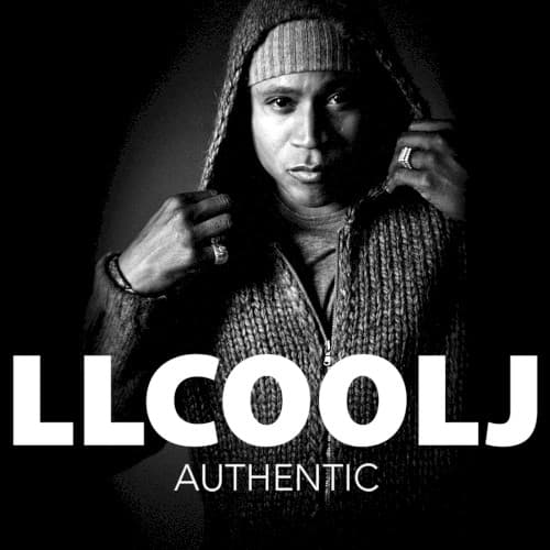
The stripped-down aesthetic recalls Queens hip-hop's golden age while acknowledging the challenge of staying current past fifty.
Visual Language
The tight framing and dramatic lighting create intimacy while the grain suggests analog authenticity rather than digital perfection.
Symbols
Knit beanie
The winter hat connects to street authenticity and hood origins, rejecting the polished celebrity image LL cultivated in Hollywood.
Hand to headphone gesture
This classic hip-hop pose references the studio booth and DJ booth, asserting his identity as a working MC.
Rings on both hands
The jewelry balances street credibility with earned success, showing he hasn't forgotten where he came from despite achieving wealth.
Where Sound Meets Image
The visual austerity mirrors the album's return to boom-bap production and traditional MCing after LL's pop-rap experiments. The headphone gesture references the studio grind, connecting to tracks about his work ethic and longevity in the game. The monochrome palette reflects the album's introspective tone—less party anthems, more veteran perspective on hip-hop's evolution. His serious expression and centered composition communicate the album's central tension: proving authenticity while acknowledging commercial success.
This cover influenced how aging hip-hop artists visually positioned comeback projects, showing that stripping away gloss could rebuild credibility. The bold typography treatment—artist name as statement—became a template for veteran MCs reasserting relevance. While not widely referenced, it represents an important moment when a founding hip-hop figure used visual language to bridge generational gaps and reclaim space in a youth-obsessed culture.