Style & Context
Influences
Children's book illustration, folk art, Tumblr aesthetic, blog-era minimalism
Location
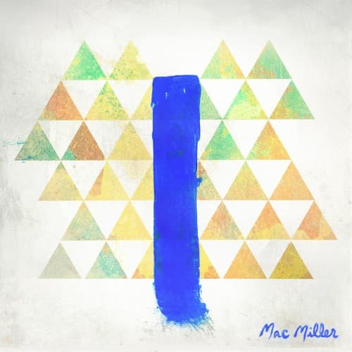
The title references an actual blue slide in Pittsburgh's Frick Park where Miller grew up skateboarding.
Visual Language
The deliberately amateurish execution channels elementary school art class, positioning Miller as relatable rather than aspirational.
Symbols
Blue vertical brushstroke
The slide represents childhood joy while bisecting the geometric pattern like adolescence disrupting innocence.
Triangle mosaic pattern
The repeating shapes suggest neighborhood playground equipment and the geometric simplicity of youth.
Hand-painted texture
The visible brushwork rejects commercial polish, aligning with Pittsburgh's working-class indie rap aesthetic.
Where Sound Meets Image
The watercolor playfulness directly reflects Blue Slide Park's breezy production and carefree lyrical content about house parties, young love, and hometown nostalgia. Where Mac's later work would explore darkness and addiction, this debut celebrates simple pleasures—the blue slide becomes a monument to innocent fun before fame complicated everything. The pastel triangles mirror the album's soft jazz samples and sing-song flows, while the handmade quality matches Mac's self-produced beats and conversational delivery. The cover promises exactly what the music delivers: unpretentious good vibes from a Pittsburgh kid who hadn't yet confronted adulthood's weight.
This cover anticipated the wave of minimalist, illustration-based rap artwork that would dominate the streaming era, where simple graphics work better as tiny thumbnails than complex photography. The childlike aesthetic influenced countless SoundCloud and college rappers who adopted similar pastel palettes and hand-drawn elements to signal accessibility over aggression. In retrospect, the cover's innocence becomes tragic—a snapshot of Mac Miller before the darkness that would consume his later work and ultimately his life.