Style & Context
Influences
film noir, blaxploitation posters, kung-fu movie stills, underground comic books
Location
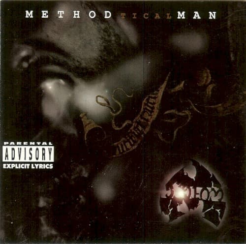
The shadowy aesthetic reflects Staten Island's Stapleton Projects where Wu-Tang formed, a world away from Manhattan's spotlight.
Visual Language
The grainy texture mimics both low-budget martial arts films and the gritty reality of '90s New York streets.
Symbols
Glowing marijuana joint
The lit blunt serves as the only true light source, positioning weed as enlightenment and creative fuel.
Golden Tical chain necklace
The ornate lettering transforms the album title into actual jewelry, making the music itself precious metal.
Partially obscured face
Method Man emerges from shadow like a phantom, embodying Wu-Tang's philosophy of mystique over celebrity exposure.
Where Sound Meets Image
The visual murk matches the album's production—RZA's beats on Tical are spare, menacing, and shrouded in atmospheric haze. The obscured visibility mirrors Method Man's slurred, relaxed flow that emerges from the sonic fog. The glowing joint directly connects to tracks celebrating marijuana culture, while the darkness reflects the album's paranoid undertones and street narratives. The golden lettering stands for Meth's charisma cutting through even the grimiest production.
This cover established the visual template for Wu-Tang solo releases—minimal lighting, heavy shadow, mystique over clarity. The marijuana-as-illumination concept influenced countless hip-hop covers that followed, from Redman to Cypress Hill's later work. The refusal to present a clean, well-lit artist portrait became a Wu-Tang trademark that peers like Mobb Deep and later artists like Griselda would adopt. Even the typography style—ornate gold lettering against darkness—became a Wu-Tang visual signature replicated across the Clan's extensive discography.