Style & Context
Influences
Dilla-era tape aesthetics, early digital photography, DIY punk zines, Earl Sweatshirt visuals
Location
This visual language speaks to New York's experimental rap underground where MIKE emerged alongside peers like Navy Blue.
Visual Language
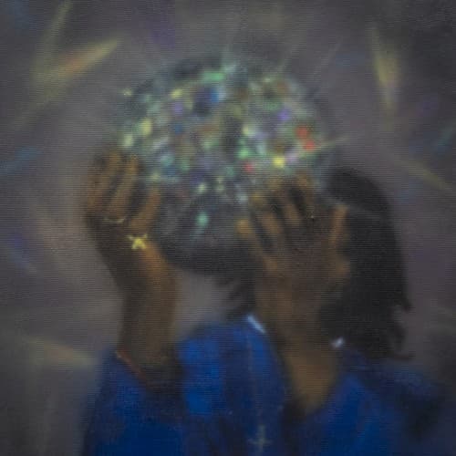
The deliberately degraded image quality functions as aesthetic philosophy, rejecting HD clarity for texture and mood.
Symbols
Prismatic glass object
The refracted light symbolizes fractured identity and the way trauma distorts perception and memory.
Obscured face
Anonymity and privacy protect the artist's vulnerability while creating space for listener projection and interpretation.
Low-resolution grain
The degraded image quality reflects lo-fi production values and resistance to commercial polish and perfectionism.
Where Sound Meets Image
The prismatic distortion directly mirrors MIKE's production approach of layering warped soul samples over hazy drums. Just as the glass refracts and multiplies light into spectrum fragments, his beats deconstruct and reimagine source material into something abstract yet emotionally resonant. The visual grain matches the tape hiss and vinyl crackle that texture his soundscapes, while the obscured identity reflects lyrics that circle around grief, memory, and self-examination without ever presenting simple answers.
This cover helped codify the visual language of the post-Earl Sweatshirt underground, where degraded image quality and obscured identity became markers of authenticity. The approach influenced countless SoundCloud and Bandcamp releases, proving that evocative mood could trump technical perfection. It demonstrated that album art for experimental rap could function as abstract expression rather than traditional portraiture or graphic design.