Style & Context
Influences
Stanley Kubrick, war photojournalism, Eastern European propaganda posters, glitch aesthetics
Location
Tyler positions himself as both observer and participant in systems designed to monitor and control.
Visual Language
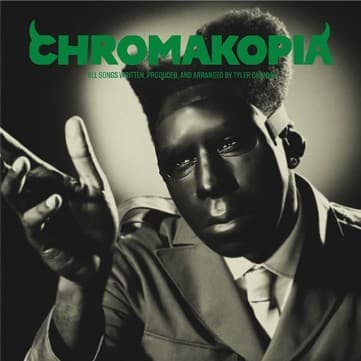
The theatrical lighting and centered composition recall Kubrick's symmetrical framing and psychological intensity.
Symbols
Gas mask
Tyler shields his identity while simultaneously making himself the spectacle he critiques.
Business suit
Corporate America and militarization merge into a single authoritarian uniform of control.
Dual assault rifles
The weapons point outward at the viewer, reversing the gaze of surveillance.
Where Sound Meets Image
The visual austerity matches Chromakopia's stripped-down production and introspective lyrics about fame's psychological toll. Tyler examines how celebrity transforms artists into products, surveilled and packaged for consumption. The weapons suggest defensive posturing against an invasive public, while the suit represents the industry machinery that monetizes vulnerability. The stark photography mirrors the album's raw confessional moments, where Tyler drops his usual playful persona for something harder and more guarded.
This cover extends Tyler's evolution from shock-rap provocateur to visual conceptualist, abandoning the pastel whimsy of previous eras. The design influenced a wave of monochrome hip-hop covers with neon accents, becoming shorthand for artists interrogating technology's impact on consciousness. It demonstrated how minimalism could convey paranoia more effectively than maximalist chaos.