Style & Context
Influences
Net art, VHS distortion, 2010s digital collage, flag-portrait tradition
Location
Harlem and the wider New York scene sit behind the A$AP Mob image without being shown literally.
Visual Language
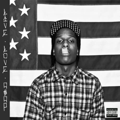
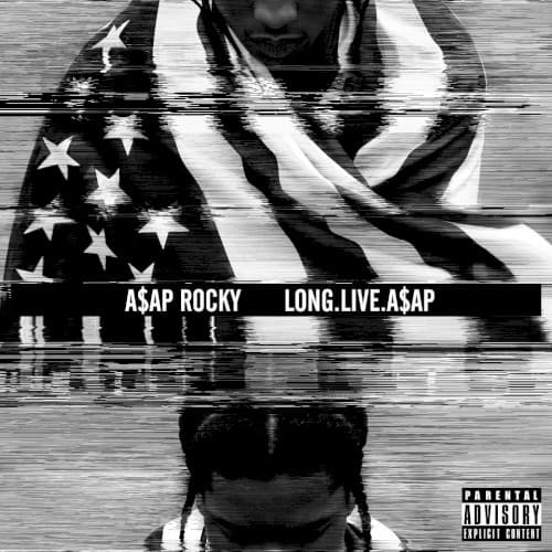
Scan-line smearing turns a straightforward studio portrait into a distorted, screen-captured image with a restless digital texture.
Symbols
American flag drape
The flag wraps his shoulders like a cloak, casting the rapper as a figure in ownership of an American story.
Glitch scan lines
Horizontal tearing mimics a corrupted video feed, hinting at hype, screens and a signal that cannot be contained.
Mirrored lower face
The inverted head in the bottom reflection makes the portrait a double image, a persona and its echo.
Where Sound Meets Image
The fractured imagery matches an album that blends cloud rap, chopped and screwed slowness, trap and pop-leaning hooks. A bright crossover single sits beside the murkier atmosphere of "Long Live A$AP" and "Wild for the Night". The distortion mirrors that stylistic collage, while the doubled portrait reflects the push and pull between street credibility and mainstream stardom.
The glitch-and-flag approach helped fold digital distortion into mainstream rap packaging. It gave A$AP Worldwide a recognizable visual identity that blended fashion-world polish with internet-age grit.