Style & Context
Influences
punk zines, street photography, Beat Generation documentation, downtown art scene
Location
The image captures white rappers navigating hip-hop authenticity through humor and musical eclecticism.
Visual Language
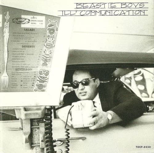
The unpolished snapshot quality channels punk DIY principles into hip-hop visual language.
Symbols
Drive-in menu board
American car culture becomes a vehicle for artistic freedom and genre rebellion.
Vintage telephone handset
Communication technology symbolizes the album's mission to transmit ideas across musical boundaries.
Sunglasses indoors
The shades maintain mystique while suggesting these artists operate on their own terms.
Where Sound Meets Image
The unstructured, documentary-style photography mirrors the album's loose, jam-session quality and genre experimentation—tracks shift from punk thrash to instrumental funk to jazz-rap without warning. Just as the cover presents an everyday moment elevated to art, Ill Communication transforms disparate influences into cohesive expression. The telephone and menu board speak directly to the album title's theme of transmitting messages across boundaries, whether musical, cultural, or commercial.
This cover helped establish that hip-hop album art could reject commercial polish without sacrificing impact, influencing independent and alternative rap aesthetics for decades. The casual snapshot approach became a template for artists prioritizing authenticity over spectacle, proving that a strong concept beats expensive production. Its success demonstrated that white rappers could claim hip-hop space through musical innovation and cultural contribution rather than appropriation or pastiche.