Style & Context
Influences
Robert Rauschenberg, Kurt Schwitters, Detroit street art, sample culture
Location
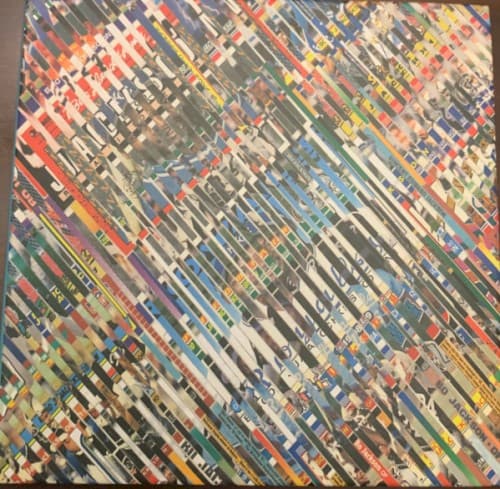
The industrial palette and fragmented composition echo Detroit's post-manufacturing landscape and survival-based street economy.
Visual Language
The technique mirrors hip-hop's fundamental creative process of repurposing existing materials into transformed art.
Symbols
Diagonal strip composition
The slanted layers represent the fragmented memories and overlapping timelines in Boldy's street narratives.
Collage methodology
The cut-and-paste aesthetic mirrors sample-based production, where disparate sources create cohesive new meaning.
Abstract obscurity
The deliberate illegibility of individual elements reflects the coded language of street economics and survival.
Where Sound Meets Image
The fragmented visual composition directly parallels The Alchemist's production style, where obscure soul samples are chopped and layered into new contexts. The diagonal orientation suggests forward momentum despite obstacles, reflecting tracks like the title cut where Boldy navigates street life with athletic precision. The refusal to center any single image mirrors the album's narrative structure, where multiple storylines and perspectives intersect without clear hierarchy, creating a complete picture only when absorbed as a whole.
The cover represents underground hip-hop's mid-2020s aesthetic shift toward art-forward abstraction over literal imagery. By eschewing the guns-and-drugs visuals typical of mafioso rap, it elevated the subgenre's artistic credibility while maintaining street authenticity through texture and color. The approach influenced subsequent Griselda-affiliated releases to experiment with fine art techniques.