Style & Context
Influences
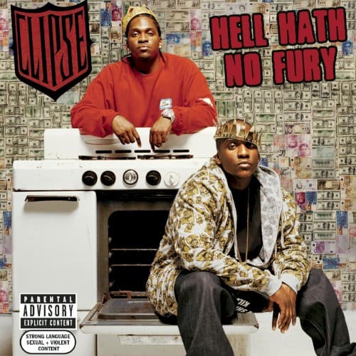
Minimalist art direction, pharmaceutical advertising, cartel documentation photography, Andy Warhol's repetition
Location
Virginia Beach's particular strain of hustler rap gets visualized through clinical precision rather than flashy excess.
Visual Language
The flat lighting and central composition mirror instruction manuals or evidence photography more than traditional rap imagery.
Symbols
White stove/range
The cook-up spot represents the transformation point where raw material becomes street product and generational wealth.
Crown on Malice
Royalty imagery claims dominion over the drug trade while mocking hip-hop's obsession with kingship and luxury.
Money wallpaper background
Currency as environment rather than goal suggests the Clipse exist inside the economics they describe so forensically.
Where Sound Meets Image
The cover's minimalism mirrors the Neptunes' skeletal production—hard drums, sparse synths, maximum impact with minimum elements. Songs like 'Wamp Wamp' and 'Mr. Me Too' dissect cocaine distribution with the same clinical precision this image employs. Pusha T and Malice stand at their workstation just as their verses methodically detail every step from brick to block. The absence of typical rap luxury reflects an album that treats the drug trade as brutal business rather than aspirational fantasy.
This cover helped legitimize coke rap's shift from glorification to cold examination. Its influence appears in how Griselda Records would later photograph their artists—gritty, unglamorous, almost documentary. The money-as-wallpaper concept has been endlessly copied, but rarely with this level of conceptual purpose. It proved rap covers could communicate through absence and restraint rather than excess, paving the way for minimalist design in hip-hop's visual culture.